Product Updates
We ship fast to help you ship faster
- 🔍 MCP Schedule Search
- 🧠 MCP Smart Data Hints
- 🔐 MCP Client Identification
- 🎯 AI Detect - Fixed Date Range Intelligence
- 💬 Slack Notifications - Dashboard-Level Configuration
- 🌙 Dark Mode - Visual Improvements
- 🔌 MCP (V0)
- 📊 Chart Builder Redesign
- 🔀 Flow Analysis (ClickHouse Support)
- ⏱️ Compare to Previous Period in Funnels
- Cohort Permission Improvements
- Export Capabilities for Admin Users
- UI Enhancements & User Experience
- 📊 Multiple Formulas in Query Reports
- ✨ Refreshed Dashboard Sharing
- 🔔 AI Detection Reset
- 🤖 AI-Powered Derived Fields
- 🤖 Smarter Anomaly Detection
- 📊 Instant Results with Smart Caching
- 🎨 Better Flow Visualizations
- 📊 Breakdown Fields in AI Readiness
- 🎨 Polished Tables & Dictionary Design
- ✨ AI Readiness Experience Upgrade
- 📈 Partial Caching
- 📊 Report Builder Refinements
- 🧠 AI Readiness: Know Where You Stand
- ⚡ Path-to-Flow Conversion Now Preserves All Settings
- 🔄 Flow Analysis: Generally Available.
- 🐛 Currency Symbols in Labels
- 🎨 Refined Report Builder Experience
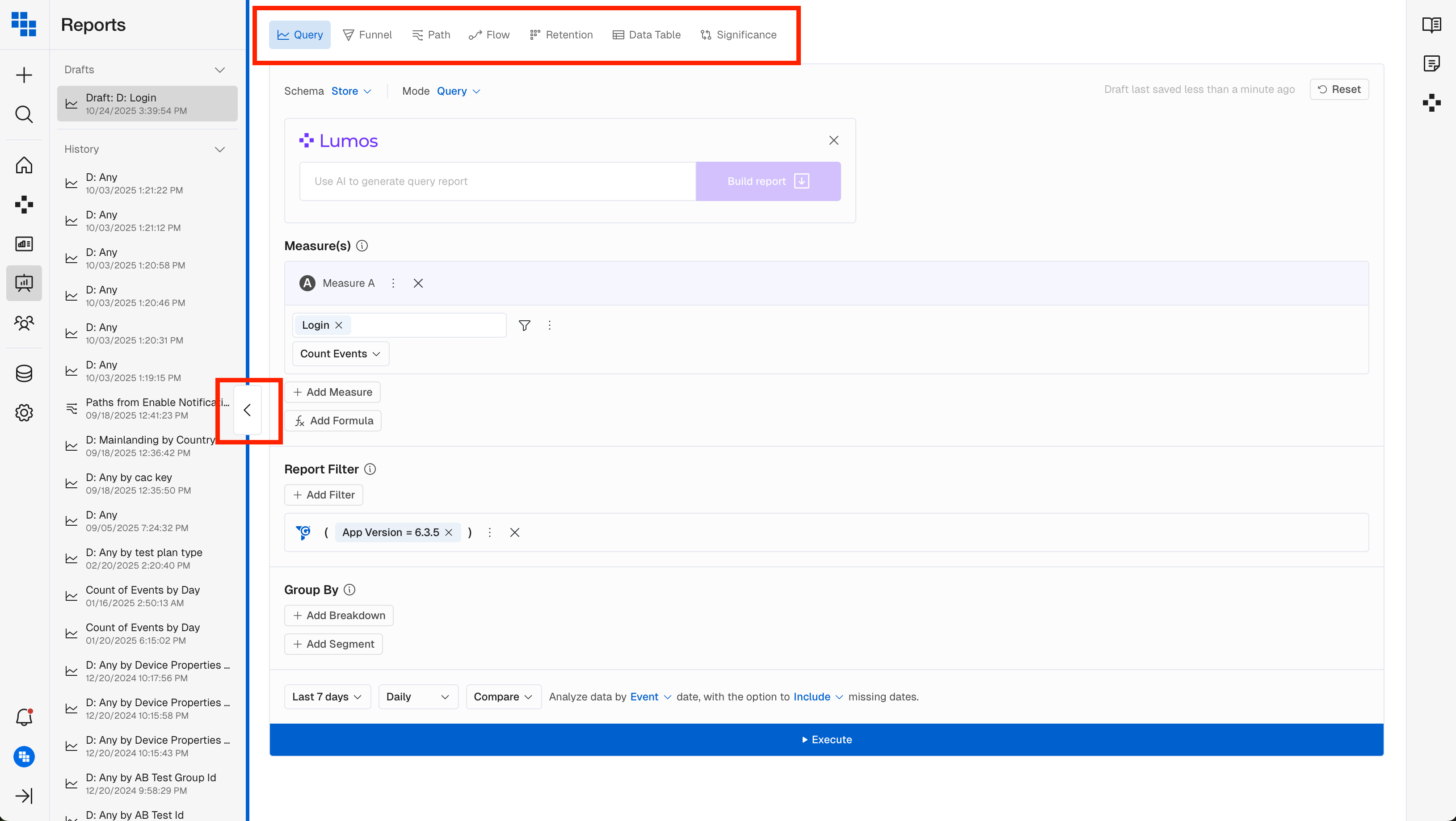
📊 Chart Builder Redesign
Building reports just got a whole lot smoother. We moved the Report builder to the left-hand side to create a more efficient and comfortable workflow. This layout lets users view the builder and the report side by side, reducing scrolling fatigue and speeding up interactions.
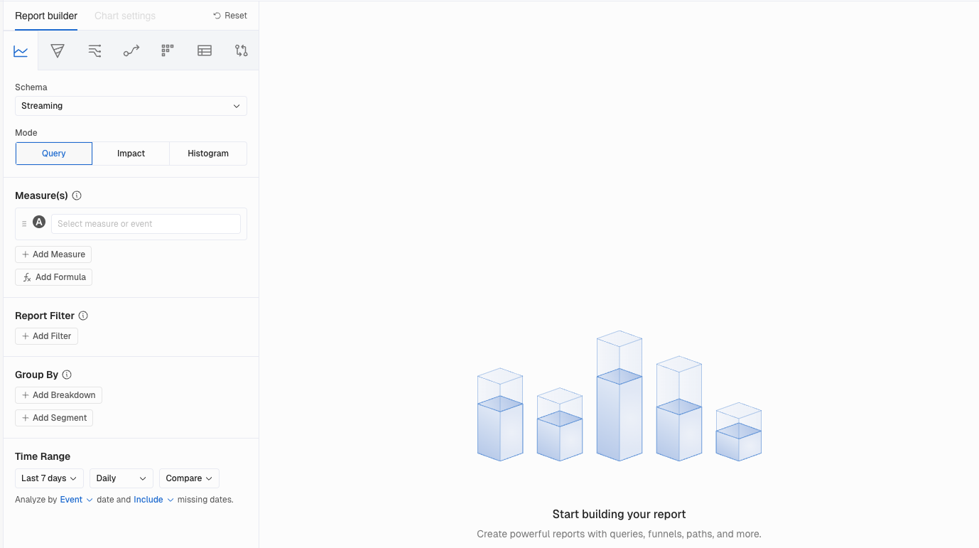
What You'll Love
The builder now lives on the left side of the screen with Chart Settings built right in. No more jumping between panels to tweak your visualization. Everything you need is in one place, right next to the chart you're creating.
Why This Matters
More screen space for your charts. Faster iteration when you're refining a report. And this layout sets the foundation for even more visualization improvements coming soon.
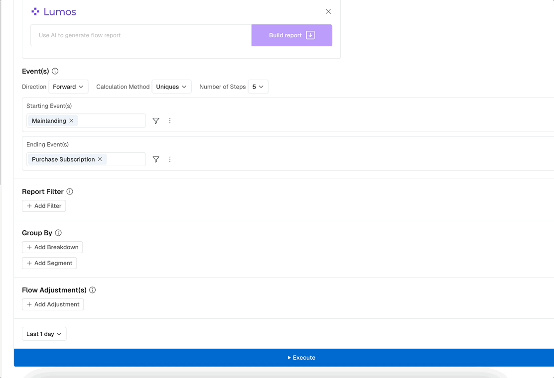
🔀 Flow Analysis (ClickHouse Support)
Flow Analysis has arrived for ClickHouse customers
Explore user journeys, spot drop offs, and understand conversion patterns with full ClickHouse performance via Flow. See how users move through your product and where they get stuck. The same powerful visualization you know, now running natively on your warehouse..
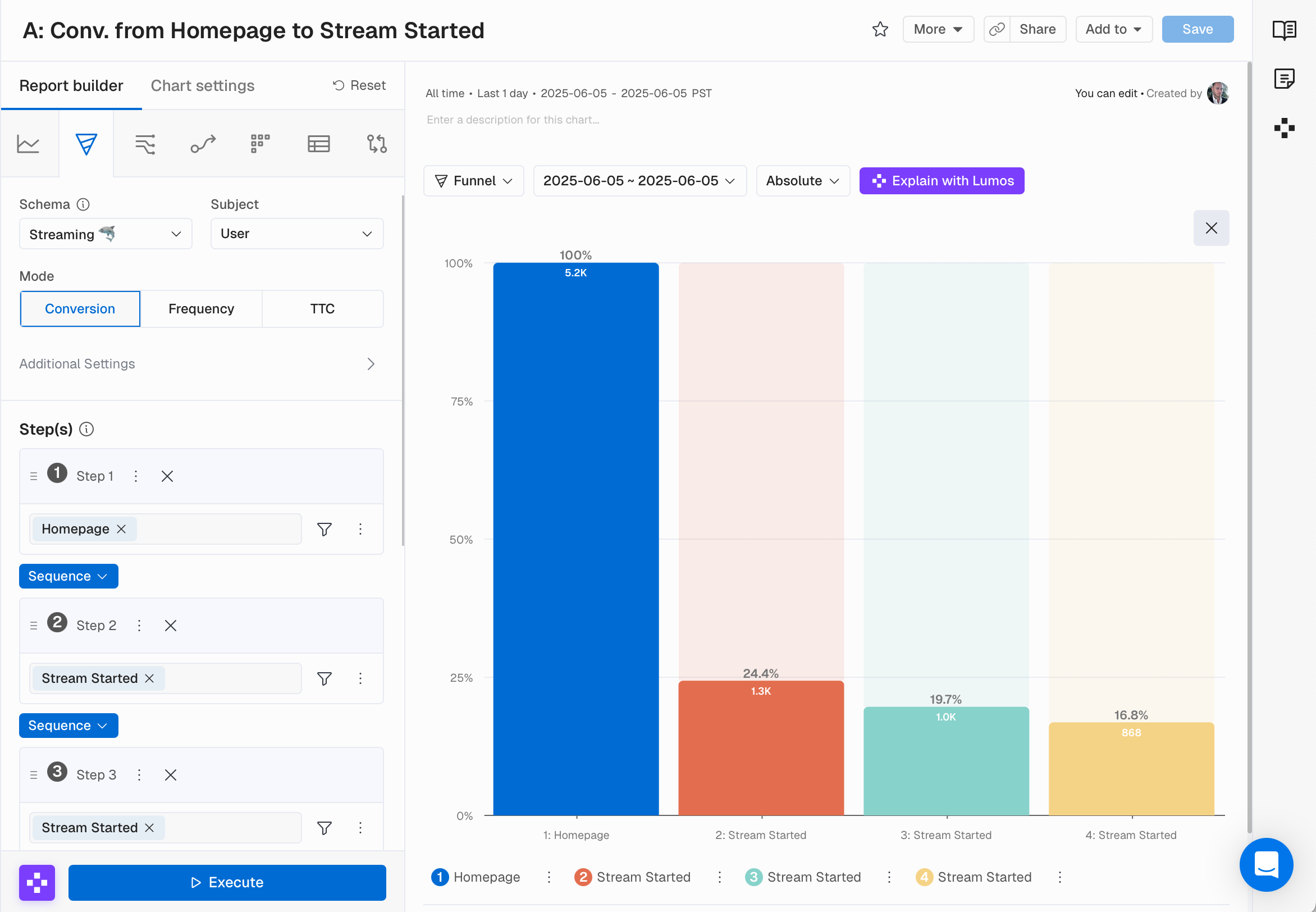
⏱️ Compare to Previous Period in Funnels
Kubit's conversion Funnels now include a powerful compare to previous period feature, letting teams instantly see how funnel performance has changed over time. By viewing step-by-step improvements or drop-offs against the prior period, it becomes much easier to validate product changes and understand shifts in user behavior.
What You'll Love
Instantly spot which Funnel steps improved or regressed. Visual indicators show you the direction and magnitude of change at every step. The comparison period automatically matches your selected date range.
Why This Matters
Validate product changes quickly. When you ship a new feature, you'll know right away whether it moved the needle on conversion.
🤖 AI Detect - General Availability
Kubit's enhanced AI Detect is now generally available, providing stronger anomaly detection across three key dimensions: Freshness (missing or delayed data), Distribution (abnormal value shifts), and Volume (unusual record count changes).
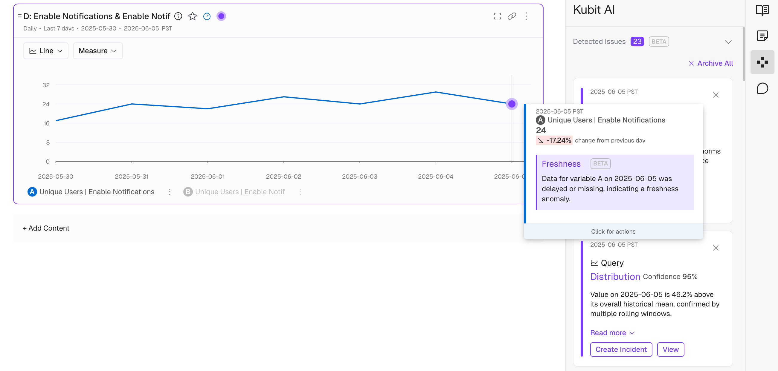
What You'll Love
Configure detection at the Report or Dashboard level. Choose whether to show anomaly indicators. Get streamlined Slack notifications with summarized views of all detected issues. Even datasets with limited days benefit from months of execution history.
Why This Matters
Catch data quality issues before they cascade into bad decisions. The system learns from historical patterns, accounting for seasonality and day of week effects, so you can trust the alerts you receive.
🤖 Enhanced AI Settings Page
Teach Kubit's AI about your business. Enter company specific instructions that make every AI interaction more relevant to your organization.
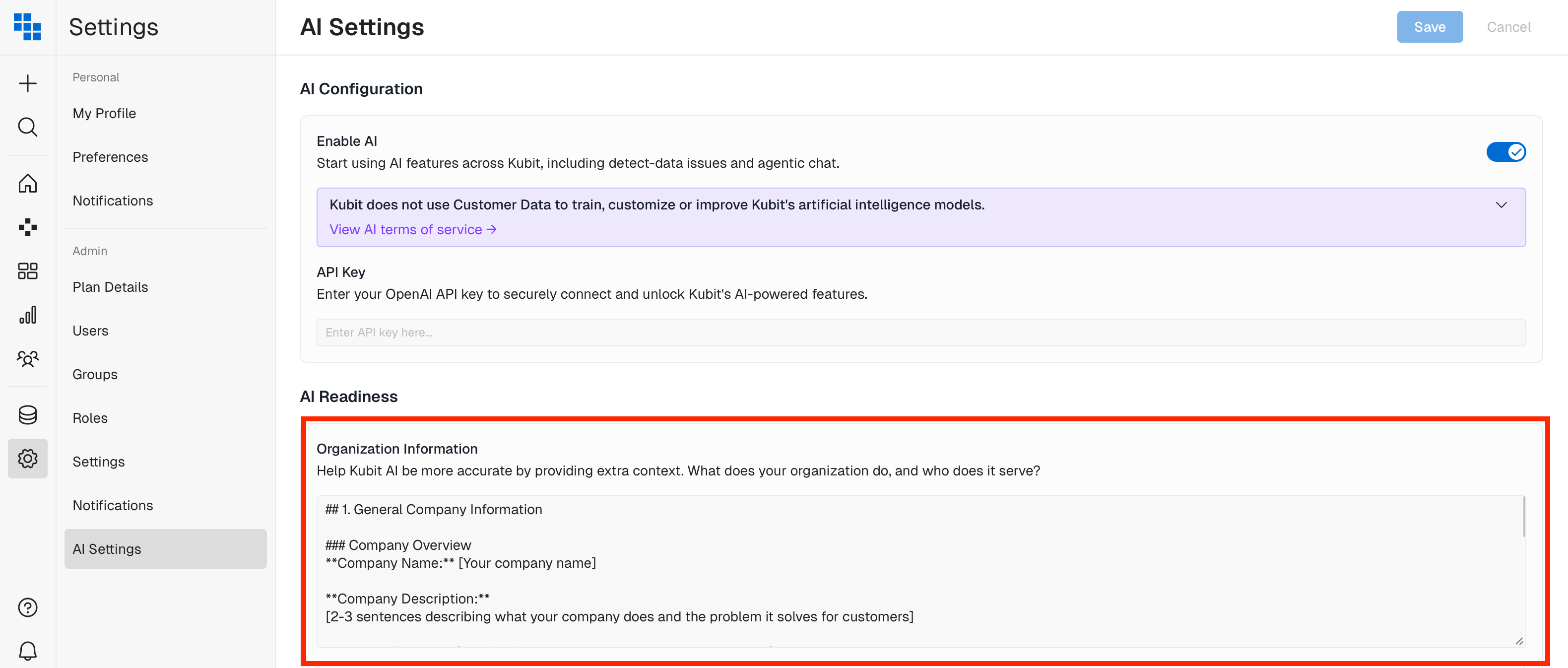
What You'll Love
Add context about your industry terminology, business goals, and how you think about your data. Configure global instructions at the account level and schema specific instructions for tailored responses.
Why This Matters
Generic AI responses become personalized insights. The AI speaks your language because you've taught it what matters to your team.
🔍 Enhancements to AI Detect
We've improved the anomaly detection experience with better cell highlighting in Retention Tables and the ability to toggle anomaly visibility on reports.
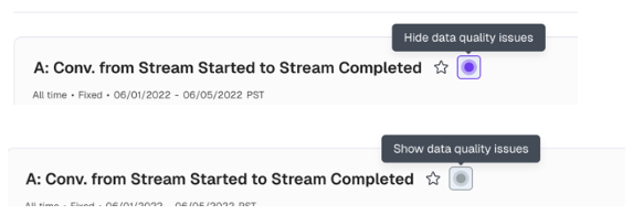
Before: Anomalies in Retention Tables blended in, and you couldn't hide anomaly indicators when you needed a clean view.
Now: Pronounced purple highlighting makes anomalies pop. A new toggle next to the Favorites star lets you show or hide anomalies, and your preference saves with the report.
The result: Full control over how you see your data. Focus on anomalies when investigating, hide them when presenting.
🔀 Virtual Events in Flow
Since our release of Flow, we've continued making enhancements based on customer feedback. Flow now supports Virtual Events, allowing you to include complex event combinations in your Flow analysis.
What You Can Do Now
Use complex event combinations as starting points, intermediate steps, or conversion goals. Analyze conversion paths with custom logic and track drop offs across multi event journeys. More accurate flow analysis for the way your users actually behave.
🔮 AI Detect - Beta Release
For every time series analysis, Kubit's anomaly detection engine now automatically calls out outliers as purple dots on the chart. Behind the scenes, an AI model analyzes historical data while considering seasonalities, skipping known incidents and reducing false alarms.
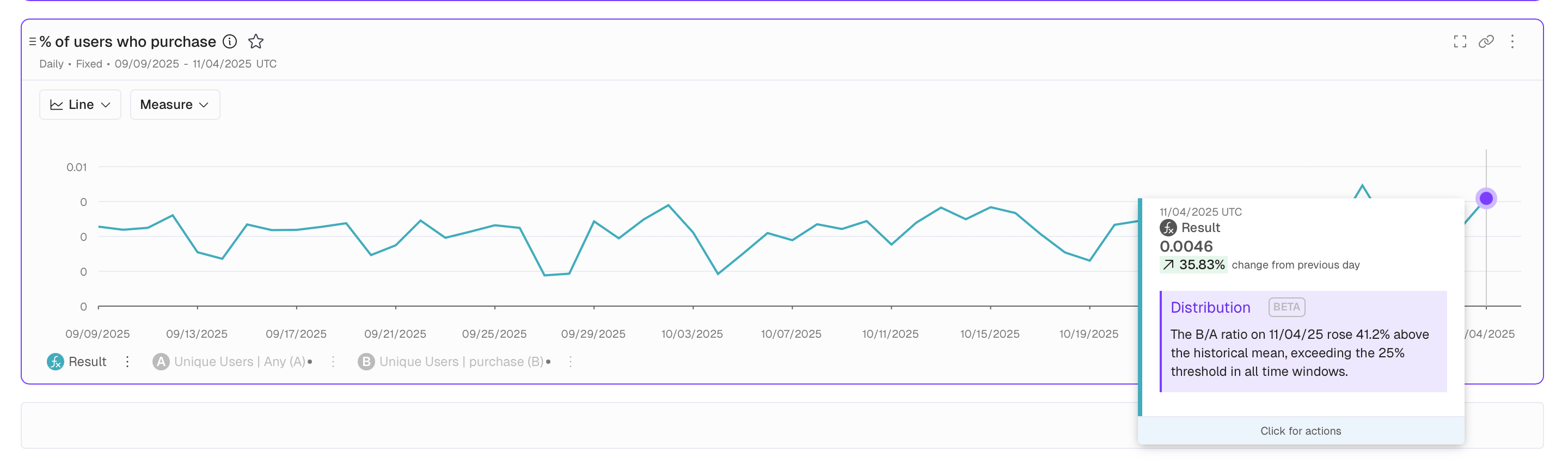
What You'll Love
Hover over any purple dot to understand why it was flagged. The detection considers seasonal patterns and skips known incidents that might skew results. No configuration required.
Why This Matters
Faster identification of data quality issues. Less manual monitoring. More confidence in your data with automated quality checks running in the background.
📖 Data Dictionary - Field Description Updates
As part of our AI Readiness initiative, you can now update Field descriptions directly in the Data Dictionary without requiring a refresh or update. This works exactly like it does for Events, Measures, and other Catalog items.
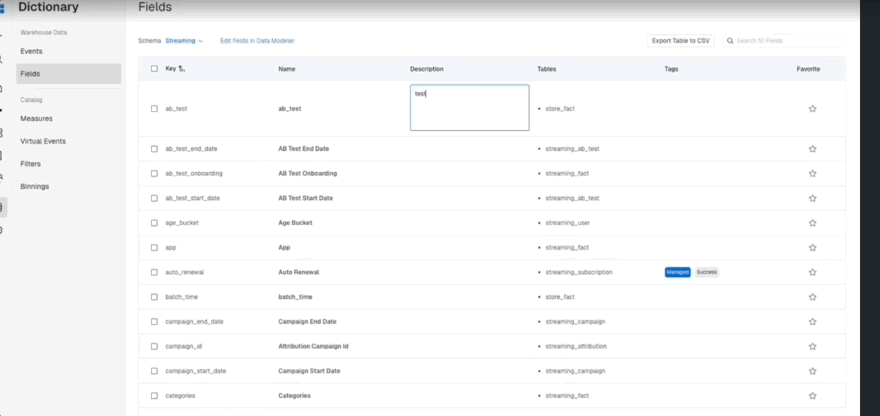
What You Can Do Now
- Update field descriptions directly in the Data Dictionary
- Add context and metadata to fields without triggering a schema refresh
- Maintain consistent documentation across events, fields, and all catalog items
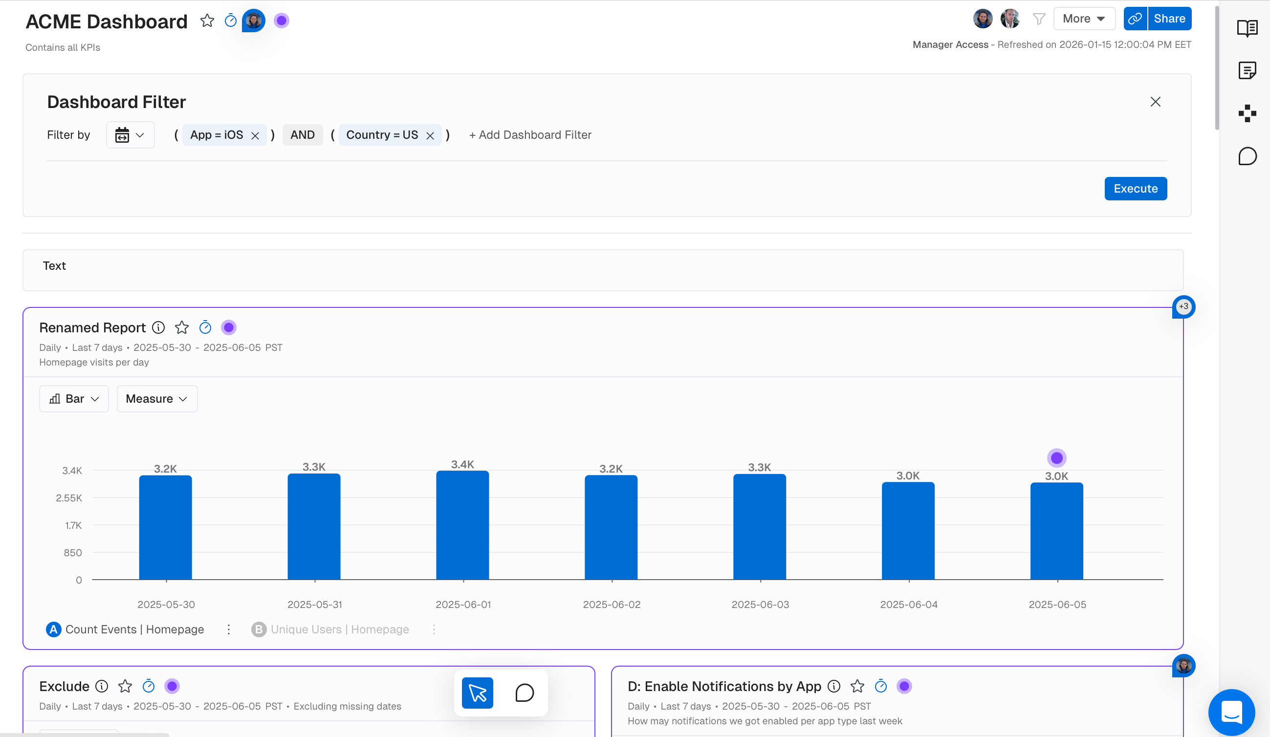
📋 Headers Enhancement
Before: Dashboard Filters cluttered the header, and descriptions were separated from their associated elements.
Now: Filters live in the More menu, descriptions sit right next to headers, and actions follow a clear primary/secondary/tertiary hierarchy.
The result: Navigation that gets out of your way. Modern UX patterns that feel familiar and intuitive.
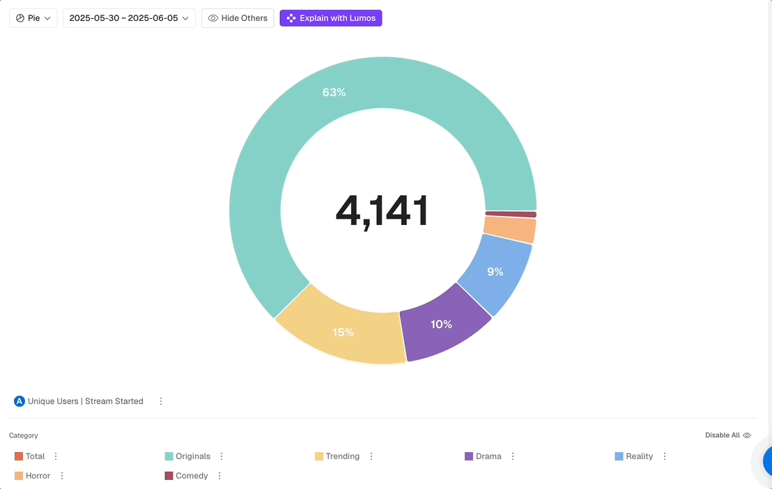
🥧 Pie Chart - Dynamic Center Display
The center number now updates when you hide sections.
When you click on Hide Others you can now toggle groups on and off while the center automatically recalculates to show only visible data. No more mental math to figure out what the current total is and what percentage of it is each group. Your summary statistics always match what you're actually viewing.
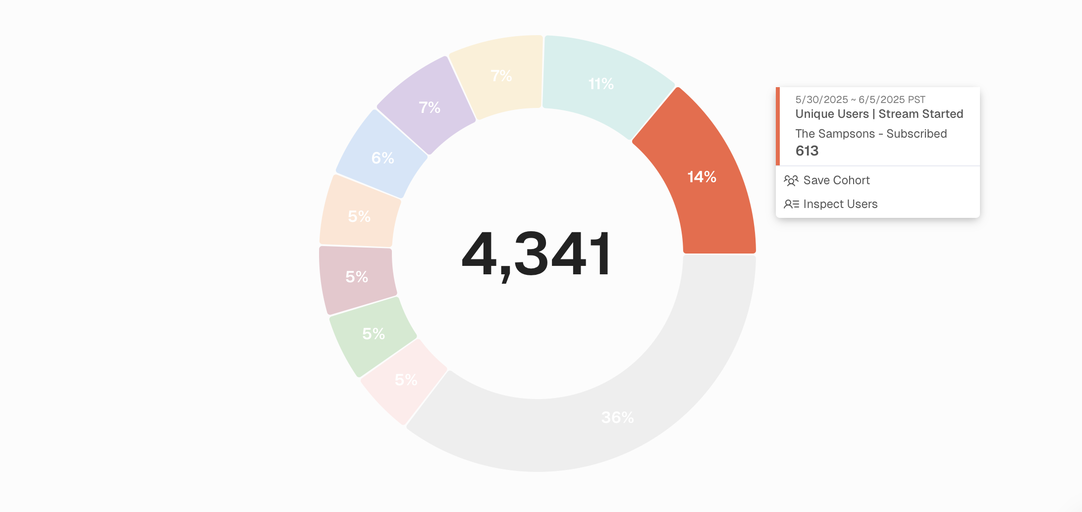
🥧 Pie Chart - Visual Enhancements
Before: Pie charts got cut off with some segments, tooltips were sometimes displayed incorrectly, and you couldn't access user actions from segments.
Now: Tooltips work properly, Create Cohorts and Inspect Users are accessible from segments, and increased report height accommodates more detailed legends.
The result: Full functionality from your pie chart interactions, regardless of complexity.
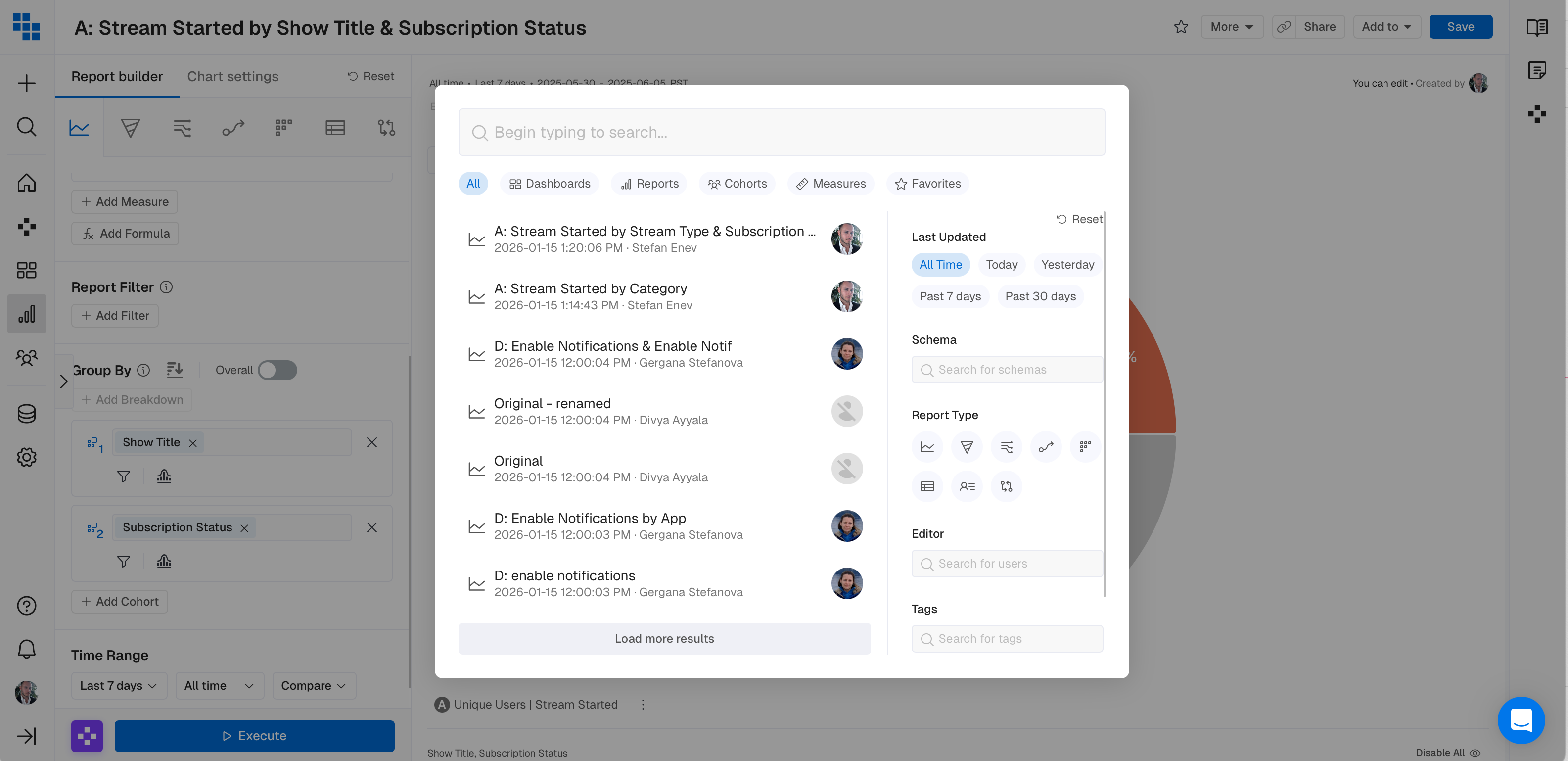
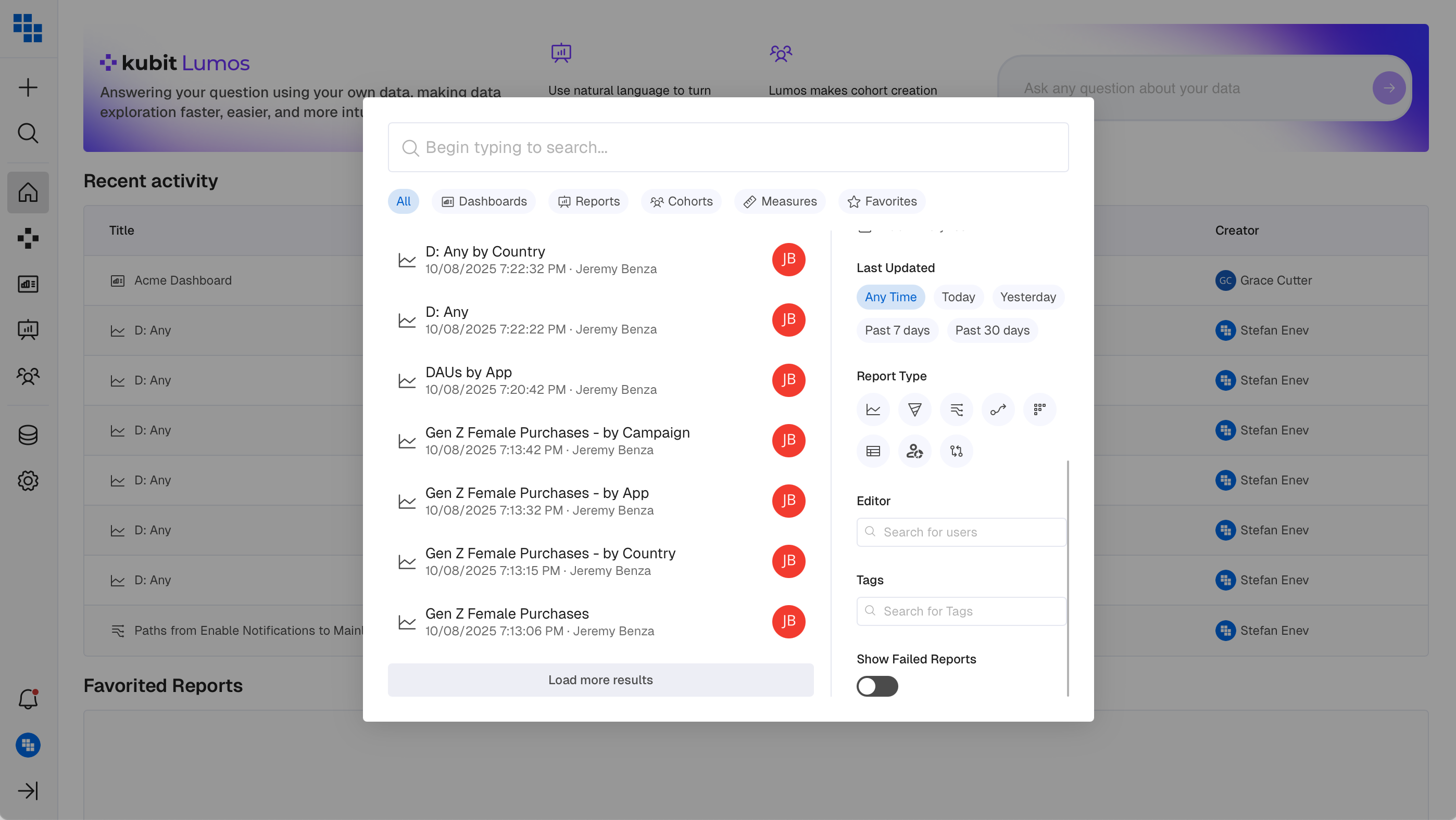
🔍 Global Search Enhancement
Updated icons and Filters throughout Search.
Clearer icons, more intuitive Schema, Editor and Tags filtering plus faster content discovery across the platform. Find what you need faster with consistent visual language.
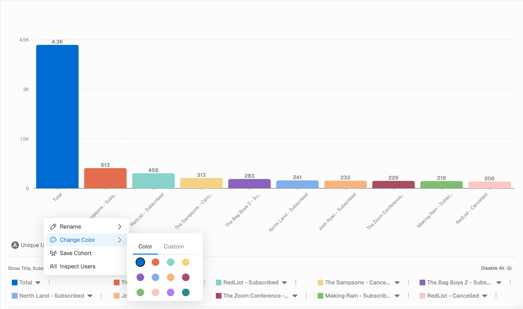
🎨 Chart/Report Colors Enhancement
We enhanced the color scheme within all Charts and Reports and expanded the palette for more granular customization. More colors mean better visual distinction between data series. Create professional looking reports that align with your brand. Greater flexibility in how you tell your story visually.
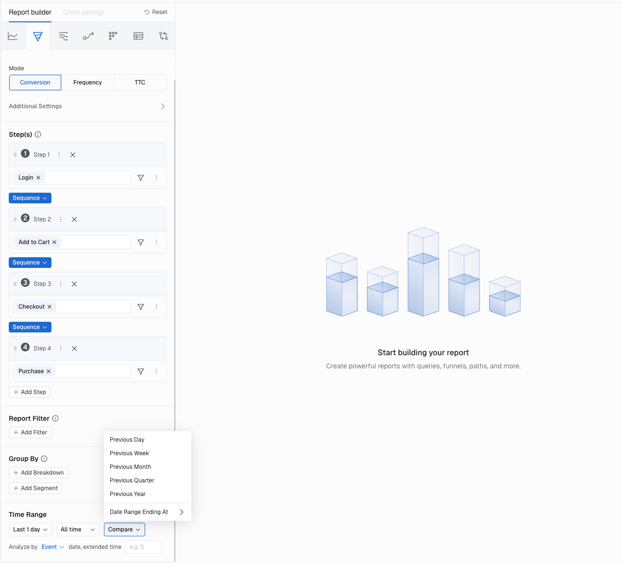
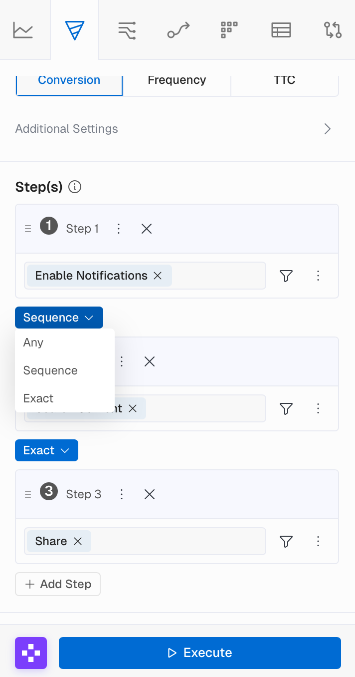
🔄 Funnel Order Enhancement
We've streamlined Funnel building by moving the Order selection between each step, defaulting to Sequence.
What You Can Do Now
- Set step order directly between Funnel steps
- Default to
Sequenceorder (previously required manual selection) - Use
Anyorder on step 1, which automatically applies to all subsequent steps
What Impact Does This Have
- Faster Funnel building with sensible defaults
- Clearer visualization of step relationships
- Reduced clicks when building complex Funnels
📱 Sidebar Navigation
We've streamlined navigation by consolidating everything to the left side for a cleaner, more intuitive experience. This update includes a collapsible secondary panel to maximize your workspace.
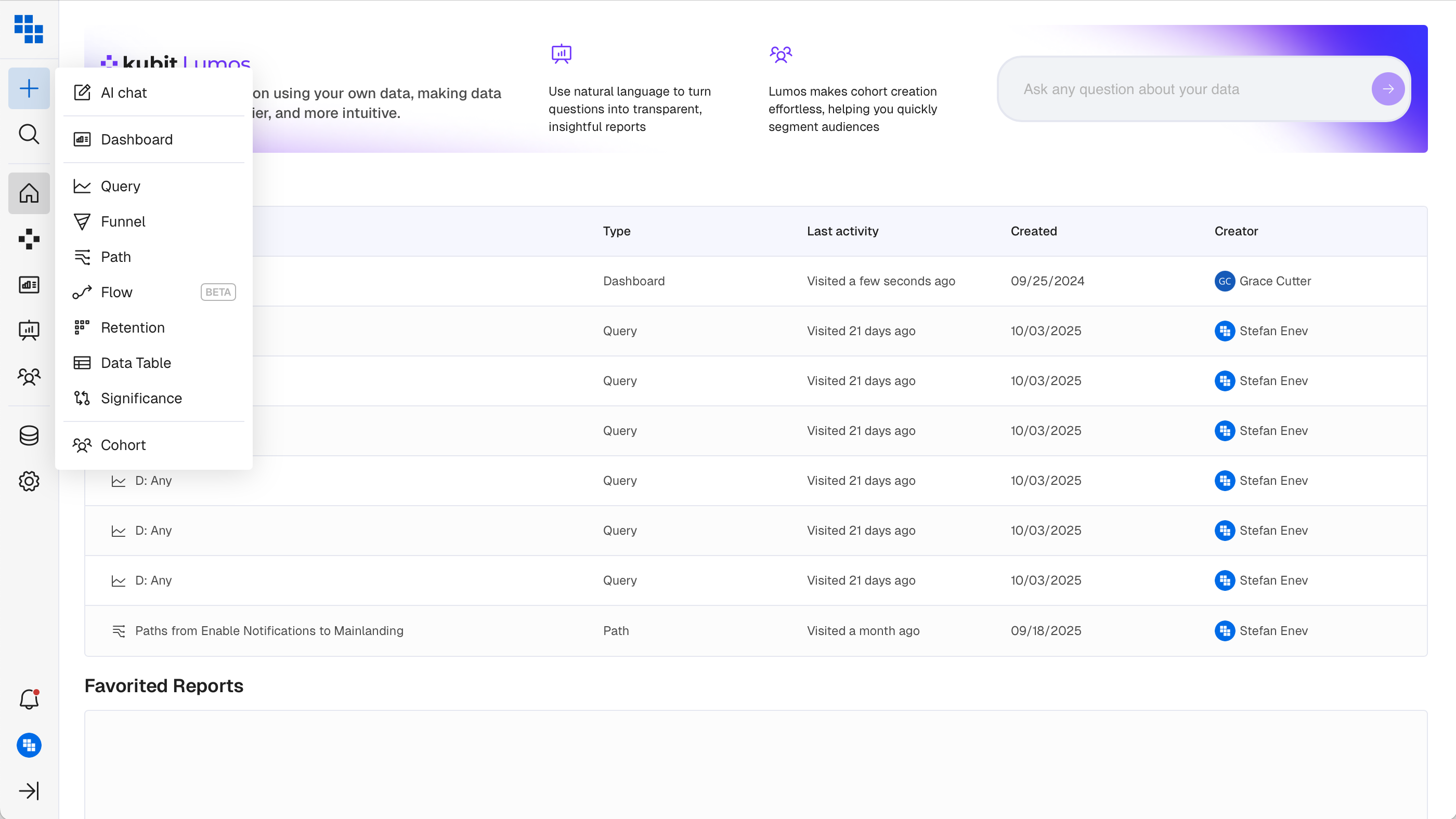
What You'll Love
The + icon provides quick shortcuts to create Reports, Dashboards, and Cohorts. Collapse the secondary panel when you need more room. All navigation in one predictable place.
Why This Matters
- More screen real estate for your content.
- Simplified navigation hierarchy that reduces cognitive load.
- A foundation for future navigation improvements.
🔎 Search Redesign
📂 Collapsible Report History
You can now collapse the History panel when building a Report for more focused workspace. Report Type selection has been moved to the top for easier access.
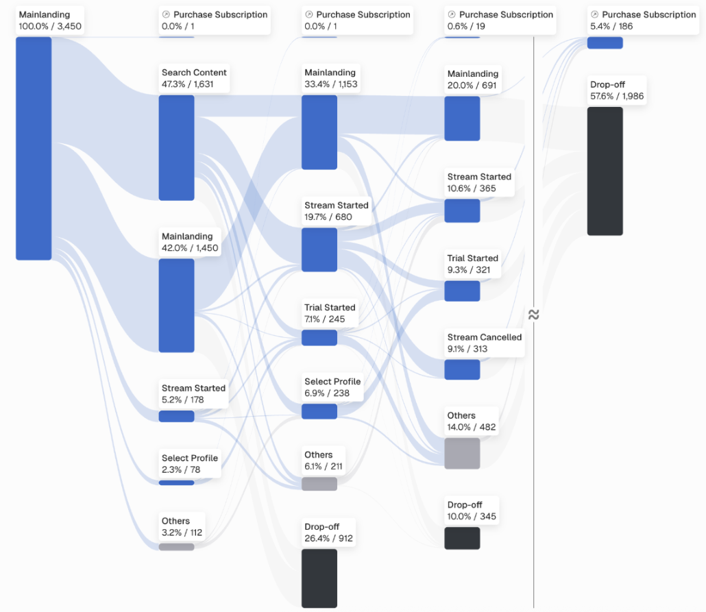
🔀 Flow - Beta Release
Meet Flow: the evolution of Path analysis. Unlike Path (which only shows users who completed the journey), Flow shows everyone who started and where they dropped off.
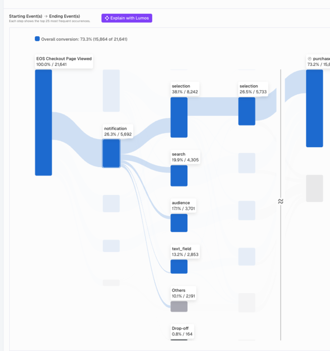
What You'll Love
See all users who entered a flow, not just those who converted. Drop off counts at each step reveal the full picture of user journey completion and abandonment. A Sankey visualization makes patterns immediately clear.
Why This Matters
Complete visibility into user journey health. Data driven insights for improving conversion funnels with a clear view of where users exit. Understand why users don't convert, not just that they didn't.
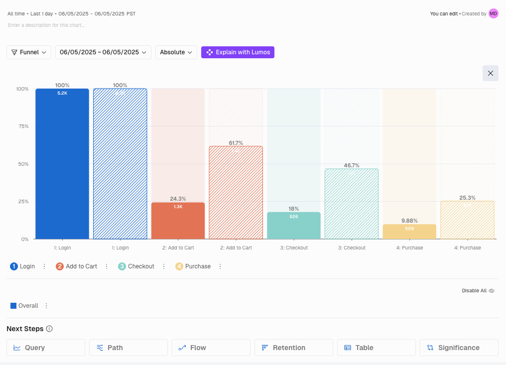
📊 Funnel Chart - Visual Enhancements
We've made enhancements to how Funnel charts display data, making insights easier to interpret and improving overall user experience.
Before: Drop-offs were hard to see when user counts were small, requiring hover interactions to understand patterns.
Now: Improved proportional rendering and visual indicators make drop offs visible at a glance, even for small volumes.
The result: Faster identification of problem areas. Reduced analysis time with insights you can see immediately.